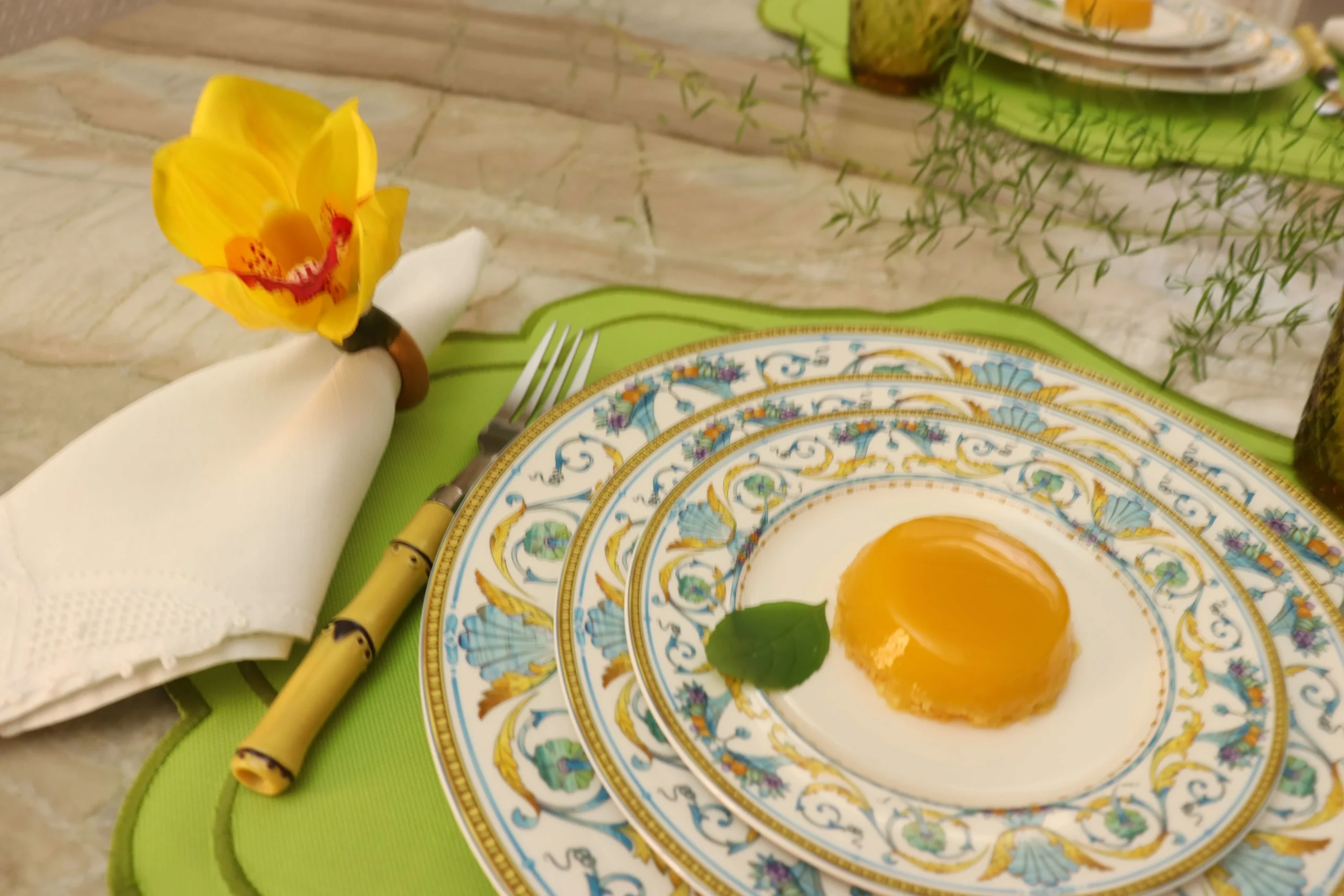
Spring table setting ideas should feel effortless, refined, and naturally seasonal.
A green and yellow palette captures renewal while maintaining timeless elegance.
-
Green introduces natural freshness and calm
-
Yellow adds warmth and gentle luminosity
-
Neutral foundations create sophistication
-
Structured dinnerware anchors seasonal accents
-
Texture elevates color into experience
When thoughtfully layered, spring table setting ideas become more than decoration, they become atmosphere.
Spring Table Setting Ideas for an Elegant Green and Yellow Table
The Psychology Behind Green and Yellow in Spring Design
Color is never accidental in seasonal styling.
Green signals renewal, growth, and stability. It reconnects interiors to the outdoors just as nature begins to awaken. In design psychology, green is restorative, it lowers visual stress and creates balance.
Yellow, when softened, communicates optimism. It reflects natural sunlight rather than artificial brightness. In spring tablescapes, yellow should never overpower. Instead, it should behave like light: subtle, diffused, atmospheric.
Together, these tones create emotional equilibrium, freshness without chaos, warmth without intensity.
Spring elegance lives in this balance.
Establishing a Neutral Foundation First
Before introducing color, define structure.
A sophisticated table always begins with restraint.
-
Ivory or soft white tablecloth
-
Natural linen runner
-
Light oak or woven placemats
-
Clear or delicately tinted glassware
-
Classic porcelain base
Neutrality prevents seasonal decor from feeling thematic or temporary.
That same principle becomes even stronger when the full dining environment follows the same restraint, especially in Dining Room Lighting Ideas That Actually Work , where light temperature helps seasonal palettes remain visually elegant after sunset.
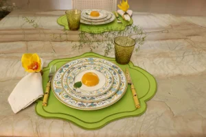
A timeless porcelain set, such as a refined pattern from Mikasa, provides visual grounding. Its structured form ensures that botanical accents and citrus elements feel curated rather than decorative.
Foundation determines longevity.
Layering Green with Intention
Green should appear in varied tones, not one dominant shade.
Consider:
-
Sage linen napkins
-
Olive-tinted stemware
-
Fresh eucalyptus or fern stems
-
Subtle botanical motifs in dinnerware
-
Soft ceramic pieces in muted moss tones
Repetition builds rhythm. Variation creates depth.
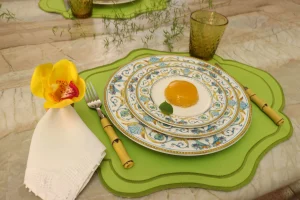
Instead of overwhelming the table with foliage, allow greenery to guide the eye gently across the surface. A Mikasa plate featuring understated botanical detailing can quietly reinforce the palette without dominating the setting.
Layering is about harmony, not abundance.
Introducing Yellow as a Highlight
Yellow performs best when used sparingly.
Think of it as illumination rather than statement.
-
Pale yellow taper candles
-
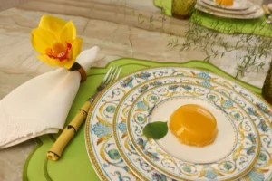
Butter-toned folded napkins
-
Fresh lemons placed organically along the runner
-
Delicate florals in soft golden hues
Avoid saturated shades that compete with greenery. Spring refinement favors subtle warmth.
When yellow is diffused across small accents, the entire composition feels lifted.
Lightness defines elegance.
Texture: The Element That Separates Casual from Elegant
Color attracts attention. Texture sustains it.
A layered spring table should combine:
-
Smooth porcelain
-
Soft washed linen
-
Organic wood grain
-
Transparent glass
-
Living botanical elements
Contrast between matte and shine creates dimensional richness. Crisp dinnerware placed against relaxed fabric introduces tension, and tension creates visual interest.
Texture transforms seasonal styling into editorial styling.
Symmetry, Spacing, and Visual Breathing Room
Luxury often expresses itself through space.
Furniture proportion influences that same sense of calm, which is why How to Choose the Right Dining Table and Chairs becomes especially relevant when seasonal styling depends on balanced spacing.
Overcrowding a spring table undermines refinement. Instead:
-
Maintain balanced spacing between place settings
-
Keep centerpieces low and proportional
-
Allow negative space to frame key elements
When symmetry meets breathing room, the table feels intentional.
Elegance is rarely loud. It is measured.
Styling Variations Within the Green and Yellow Palette
This palette adapts easily across aesthetics.
Modern Minimalist
-
Clean white plates
-
Single-stem greenery
-
Structured glassware
-
Soft yellow candles only
European Countryside
-
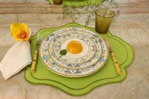
Patterned porcelain
-
Mixed linen textures
-
Abundant but controlled florals
-
Hand-thrown ceramic accents
Transitional Contemporary
-
Neutral base
-
Muted green napkins
-
Subtle yellow florals
-
Balanced metallic flatware
The palette remains consistent. Execution shifts with personality.
A well-chosen Mikasa pattern, especially one with restrained detailing, can move fluidly between these styles without feeling out of place.
Versatility is a sign of thoughtful design.
Common Mistakes to Avoid
Even a beautiful color combination can lose sophistication if misapplied.
Avoid:
-
Neon or overly saturated yellows
-
Artificial-looking greenery
-
Excessively tall centerpieces
-
Too many competing patterns
-
Plastic textures that diminish authenticity
Spring elegance depends on authenticity and proportion.
When in doubt, simplify.
How to Create a Spring Table That Feels Collected, Not Decorated
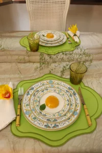
An elegant spring table should feel assembled over time, not styled in a single afternoon.
The difference between decorative and refined lies in restraint and cohesion.
-
Choose pieces that share a common undertone
-
Mix textures before mixing patterns
-
Repeat colors in small, controlled moments
-
Let one element lead the visual story
-
Edit ruthlessly before guests arrive
When every piece feels intentional, the table feels collected rather than constructed.
Start With Emotional Intention, Not Objects
Before selecting plates or florals, decide what you want guests to feel.
Do you want the setting to feel:
-
Airy and relaxed?
-
Garden-inspired and organic?
-
European and structured?
-
Contemporary and minimal?
Spring design works best when guided by emotion rather than trend.
If the goal is calm sophistication, lean toward muted greens and pale yellows.
If the goal is vibrancy, increase contrast, but maintain control.
Emotion should lead styling decisions.
Mastering Color Distribution
One of the most common styling mistakes is uneven color placement.
Instead of concentrating green in one area and yellow in another, distribute both tones evenly across the table:
-
A hint of green in napkins
-
Green stems in the centerpiece
-
Subtle green detailing in dinnerware
-
Yellow reflected in candles
-
A touch of yellow in florals
This creates visual rhythm.
The eye moves naturally when color is repeated with intention.
Consistency builds sophistication.
The Power of Repetition
Design thrives on repetition.
If you introduce a sage linen napkin, echo that tone somewhere else, perhaps in a small floral stem or glassware tint.
If you add lemons as decor, let their color subtly reappear in taper candles.
Repetition:
-
Reduces visual chaos
-
Creates subconscious harmony
-
Makes the table feel professionally styled
Spring palettes benefit from this especially because the colors are naturally vibrant.
Control is what elevates them.
Elevating the Centerpiece Without Overwhelming the Table
A spring centerpiece should enhance conversation, not interrupt it.
Keep these principles in mind:
-
Low arrangements encourage eye contact
-
Multiple smaller vessels feel lighter than one large bouquet
-
Natural asymmetry feels modern
-
Fresh greenery often works better than heavy floral density
Consider using clear glass vases so stems become part of the visual texture.
Transparency adds airiness.
And airiness is the essence of spring elegance.
Mixing Patterns Without Losing Refinement
Pattern mixing can easily turn chaotic, especially with florals.
To maintain balance:
-
Combine one patterned element with mostly solids
-
Keep patterns within the same color family
-
Vary scale (large floral + small detail)
-
Maintain negative space around patterned pieces
When pattern is controlled, it adds charm.
When uncontrolled, it distracts.
Elegance is often about what you remove, not what you add.
The Importance of Light in Spring Styling
Lighting transforms color.
Natural daylight enhances green and softens yellow. If hosting in the evening:
-
Use warm-toned candles
-
Avoid harsh overhead lighting
-
Incorporate reflective surfaces like glass or polished flatware
Soft lighting prevents yellow from appearing brassy and keeps green from feeling dull.
Spring tables thrive in gentle illumination.
Light is as important as color.
Creating a Multi-Sensory Experience
A truly elegant table engages more than sight.
Consider:
-
The softness of linen under fingertips
-
The subtle scent of fresh herbs or citrus
-
The sound of porcelain against wood
-
The warmth of candlelight
These details elevate the setting beyond aesthetics.
They transform it into experience.
And experience is what guests remember.
Editing Before the Final Reveal
Before guests arrive, step back.
Ask yourself:
-
Is any area overcrowded?
-
Does one element dominate too strongly?
-
Can something be removed to create more breathing room?
Removing one unnecessary object often improves the entire composition.
Spring design should feel effortless.
Effortlessness requires editing.
An elegant green and yellow spring table does not depend on extravagance.
It depends on intention, balance, and emotional clarity.
When color is distributed thoughtfully, textures are layered carefully, and space is respected, the table becomes more than seasonal decor.
It becomes an atmosphere of renewal, refined, welcoming, and quietly memorable.
Common Mistakes to Avoid When Styling Spring Tables
Even the most beautiful spring table setting ideas can lose their impact when small details are overlooked. Styling a table for the season is less about adding more and more about editing with intention.
One of the most common mistakes is overusing color. Spring naturally invites soft greens, yellows, florals, and pastels, but combining too many tones at once can create visual noise. Instead of layering multiple bright shades, choose one dominant palette and allow supporting tones to remain subtle.
Another frequent misstep is overcrowding the centerpiece. While florals are essential in spring table setting ideas, oversized arrangements can block sightlines and make conversation uncomfortable. A refined composition should enhance connection, not interrupt it. Low arrangements or thoughtfully spaced stems create elegance without overwhelming the table.
Texture imbalance is another detail often ignored. When everything on the table is glossy, plates, glassware, cutlery, the setting can feel flat despite its beauty. Mixing materials such as linen, ceramic, glass, and brushed metals introduces depth and visual warmth.
Lighting is also underestimated. A carefully styled table can appear dull under harsh overhead lighting. Soft candlelight or natural daylight transforms even the simplest spring table setting ideas into an elevated experience.
Finally, avoid styling without emotional direction. The most compelling tables are not built around objects but around intention, whether that intention is intimacy, celebration, or quiet sophistication. When the atmosphere leads, the design follows effortlessly.
Seasonal table styling usually becomes more convincing when the surrounding room supports the same visual language.
A spring palette rarely works in isolation because table colors respond directly to nearby materials, wall tone, and natural light conditions.
That is why broader dining decisions often influence how seasonal settings are perceived over time.
Spring Table Styling Decision Guide
| If You Want Your Table to Feel… | Focus On… |
|---|---|
| Fresh and garden-inspired | Layer greenery, herbs, and botanical details |
| Elegant and timeless | Use a neutral foundation with restrained color accents |
| Warm and welcoming | Introduce soft yellow through candles and florals |
| Light and airy | Keep centerpieces low and maintain visual breathing room |
| More sophisticated | Layer textures before adding additional colors |
| European and collected | Mix natural materials, linen, and refined dinnerware |
| Calm and balanced | Repeat colors consistently throughout the table |
The most successful spring table setting ideas begin with atmosphere, not objects. Once the desired mood is clear, decisions about color, texture, and styling become much easier.
From Styling to Experience
A table setting is not meant to exist only in photographs.
It must function.
Guests should feel comfortable reaching for glassware. Plates should allow food to remain the focal point. Centerpieces should not interrupt conversation.
The true measure of success is emotional response:
-
Does the setting feel welcoming?
-
Does it encourage conversation?
-
Does it reflect the season without overwhelming it?
When green introduces calm and yellow introduces warmth, all anchored by structured dinnerware and layered texture, the result is more than decor.
It becomes atmosphere.
Spring entertaining is not about impressing.
It is about creating a space where light, color, and presence coexist naturally.
That is the essence of elegant seasonal styling.
You May Also Like
If you’re inspired by seasonal entertaining, these guides explore how color, texture, and table styling can create memorable dining experiences throughout the year.
Discover how natural materials and layered textures create warmth in How to Elevate Everyday Table Settings Using Stoneware and Silver Flatware.
Explore a European-inspired approach to seasonal dining in Rustic Italian Table Setting with Red and White Textiles.
See how pattern can add personality while maintaining elegance in 3 Ways to Style a Gingham Placemat Table Setting for Everyday Dining.
Learn how thoughtful table details influence atmosphere in Table Setting Details That Change the Whole Atmosphere (#126).