
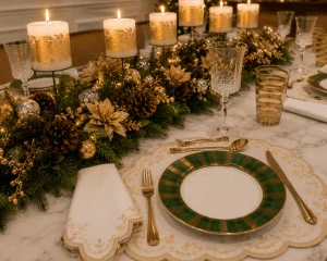
A green christmas table setting can feel traditional, elegant, and unmistakably festive without relying on the familiar combination of red and green. Deep emerald dinnerware, warm gold details, ivory textiles, clear crystal, and abundant greenery foliage create a richer interpretation of Christmas decorating, one that feels polished without becoming overly formal.
In this setting, green establishes the holiday identity while gold brings warmth and refinement. Ivory and white keep the composition luminous, crystal adds transparency, and the pale marble tabletop creates a quiet backdrop for the darker colors and natural greenery.
The result is a table designed for elegant Christmas entertaining, but it still feels inviting enough for a long dinner with family and friends.
In this article, you’ll discover:
- how to make green the main color of a Christmas table;
- why emerald green and warm gold work so naturally together;
- how statement dinnerware can become the visual anchor;
- ways to layer embroidered linens without making the table feel too formal;
- how to create a long evergreen centerpiece with natural and metallic details;
- how candlelight, crystal, and warm lighting soften a richer Christmas palette.
The most useful lesson is that elegance does not come from adding more Christmas decoration. It comes from repeating a small number of materials and colors with enough restraint that the entire table feels connected.
Why Green Works So Beautifully for Christmas Tables
Green is one of the most natural colors to use during Christmas because it connects the table to evergreen branches, Christmas trees, wreaths, and winter foliage. Yet the shade of green makes a significant difference.
Bright or highly saturated green can create a playful holiday atmosphere. Deep emerald green, by contrast, feels more established and sophisticated.
That distinction is particularly noticeable when green appears in the dinnerware.
Instead of using greenery only as decoration around otherwise neutral plates, emerald porcelain can become the color anchor of the entire table. The foliage then supports that color rather than introducing it as an afterthought.
This approach also changes the way the other colors are perceived.
Gold becomes warmer against deep green. Ivory appears brighter. Crystal looks more delicate. Even the pale gray veining in the marble becomes part of the composition because it provides a quiet transition between the dark greenery and the light surface.
One trick designers use when working with a strong color is to repeat it in several places rather than introducing many additional colors. Here, green appears in the dinnerware, centerpiece, and Christmas tree, creating continuity throughout the room.
The table therefore feels festive without needing red ornaments or brightly colored seasonal accessories.
How to Combine Emerald Green and Gold Without Overdoing It
Emerald green and gold naturally suggest luxury, but the combination can become heavy if both colors are used too aggressively.
The solution is to give each one a different role.
Green should establish the atmosphere. Gold should provide the accents.
That distinction keeps the palette controlled.
The emerald plates carry substantial visual weight because their borders are broad and saturated. Gold appears more delicately through the plate details, flatware, embroidered textiles, glassware, candles, and ornaments.
The eye therefore sees gold repeatedly, but never in one overwhelming block.
| Element | Color or finish | Role in the composition |
|---|---|---|
| Dinnerware | Deep emerald and gold | Main color anchor |
| Placemat | Ivory with gold embroidery | Softens the porcelain |
| Napkin | Ivory with gold embroidery | Repeats warmth and texture |
| Flatware | Warm gold | Connects the smaller details |
| Glassware | Clear crystal and gold bands | Adds transparency and sparkle |
| Centerpiece | Evergreen and gold | Extends the color story |
| Candles | Ivory with gold detailing | Adds warmth and height |
| Tabletop | Pale marble | Provides visual contrast |
The important point is that the gold is repeated at different scales.
A narrow gold rim on a plate is subtle. Gold flatware is more noticeable. Gold ornaments and candle details become small points of reflection.
Together, these repetitions make the metallic accent feel intentional.
Let Statement Dinnerware Become the Color Anchor
A Christmas table does not always need a decorative centerpiece to establish its personality. Sometimes the dinnerware can do that work.
The emerald plates in this setting have enough visual presence to function almost like decorative objects. Their deep green borders frame the ivory centers and create a strong contrast against the pale marble.
That makes the plates particularly important when deciding what should surround them.
If the dinnerware already has a strong border, there is no need for a heavily patterned placemat or a competing napkin fold. The surrounding elements can remain relatively quiet.

The ivory textile placemats are effective precisely because they create separation between the porcelain and marble. Their scalloped edges and delicate gold embroidery add detail without introducing another dominant color.
This is an important practical decision when building a table around statement dinnerware:
If the plate is visually strong, use texture rather than another strong pattern underneath it.
That keeps the setting layered while allowing the dinnerware to remain the first thing the eye notices.
Layering Ivory Linens Around Green Dinnerware
Ivory is doing more work here than simply providing a neutral background.
Against emerald green, ivory becomes warm and luminous. The embroidered details also repeat the gold found throughout the table, creating a connection between the soft textiles and harder materials such as porcelain and metal.
The napkins follow the same principle.
Rather than using an elaborate fold, they are simply arranged beside the plates. Their restrained treatment allows the embroidery to become the decorative detail.
This is often more effective than a complicated napkin fold when the table already contains an elaborate centerpiece.
A useful rule is to think about where the eye should rest.
The dinnerware attracts attention through color.
The centerpiece attracts attention through volume and texture.
The linens provide the quieter middle ground that allows both to work together.
That balance is what prevents a formal Christmas table from feeling visually crowded.
Creating a Long Evergreen Christmas Centerpiece
The centerpiece is the element that connects the individual place settings into one continuous composition.
Rather than using a single compact floral arrangement, this table uses a long, lush line of greenery running through the center.
That approach is particularly effective on a rectangular dining table because it follows the architecture of the surface.
Evergreen branches provide the foundation. Pinecones introduce natural brown tones and texture, while gold ornaments, decorative berries, gold-toned branches, and poinsettia-style flowers introduce the polished Christmas character.
The combination works because the natural and decorative elements have different visual qualities.
The greenery is soft and irregular.
The pinecones are organic and textured.
The ornaments are reflective.
The Gold branches add delicate texture and movement.
The greenery remains low, while elevated candles create height above it.
The candles provide height and light.
Together, they create complexity without requiring a wide range of colors.
One surprisingly simple trick is to keep the greenery visually continuous while varying the height of the decorative details above it. This creates movement along the table instead of making the centerpiece look like one repeated block.
Adding Pinecones Without Making the Table Rustic
Pinecones can easily push a Christmas arrangement toward a rustic aesthetic.
Here, they do something different.
Because they are surrounded by emerald dinnerware, gold ornaments, polished flatware, embroidered textiles, and crystal, the pinecones become a natural texture within an otherwise refined composition.
This is an important lesson when combining natural materials with elegant styling.
The material itself does not necessarily determine the style.
Context does.
A pinecone in a wooden bowl with burlap and unfinished timber will read as rustic. The same pinecone surrounded by crystal, gold, porcelain, and candlelight can feel sophisticated and seasonal.
That is why natural elements work so well in an elegant Christmas setting.
They prevent the composition from becoming too polished or decorative.
Using Candles to Create Warmth and Height
The ivory pillar candles are an important part of the visual hierarchy.
They rise above the greenery at regular intervals, introducing vertical structure to an otherwise low arrangement.
Their decorative gold detailing connects them with the metallic accents already present in the table.
But their most important role comes after sunset.
Candlelight changes the entire relationship between the materials.
Gold becomes more reflective.
Crystal catches small points of light.
The ivory linens become warmer.
The marble surface reflects the glow softly.
The greenery becomes deeper and more dimensional.
This is why candles should be considered part of the lighting plan rather than simply another Christmas decoration.
Warm room lighting also matters. The brass sconces, crystal chandelier, and warm Christmas-tree lights reinforce the golden atmosphere while visually connecting the background with the dining table.
The result is an environment that feels cohesive from one end of the room to the other.
Mixing Crystal and Gold-Banded Glassware
Glassware introduces another important layer because it adds transparency to a table dominated by solid materials.
The clear crystal stemware brings traditional elegance, while the cylindrical drinking glasses with horizontal gold bands repeat the metallic language of the dinnerware and flatware.

This is a good example of how different pieces can coexist without needing to match perfectly.
The glasses share two important qualities: transparency and restrained gold detailing.
That is enough to make them feel related.
Designers rarely need every item on a table to come from the same collection. What matters more is finding repeated characteristics—color, finish, shape, or material—that visually connect the pieces.
Here, the gold bands become a small but effective bridge between the crystal and the rest of the tablescape.
Balancing an Elaborate Centerpiece With Restrained Place Settings
When the centerpiece is abundant, the individual places should become simpler.
That does not mean they need to be plain.
The emerald plates already provide a strong visual statement. The embroidered ivory placemats and napkins add texture. Gold flatware and crystal complete the setting.
There is no need for additional Christmas ornaments at every place.
This is one of the most useful decisions to make when recreating a similar table.
If the centerpiece is doing the decorating, let the place settings do the serving.
Guests still need enough room for their plates, glasses, cutlery, and personal space. The table should feel generous rather than crowded.
A beautiful arrangement has to work once everyone sits down.
That means conversation lines should remain open, with enough comfortable space for plates, glasses, cutlery, and conversation. Decorative elements should never interfere with the practical rhythm of dinner.

Connecting the Table to the Christmas Tree
The Christmas tree in the background reinforces the table without competing with it.
Its predominantly green foliage echoes the centerpiece and emerald dinnerware, while warm white lights and restrained gold and champagne ornaments repeat the table’s metallic accents.
This creates a subtle visual connection between the dining table and the rest of the room.
The connection is important because a tablescape should not feel isolated from its surroundings.
The warm ivory walls, decorative molding, brass sconces, framed artwork, gilded mirror, dark wood furniture, cane-back chairs, and crystal chandelier establish a traditional setting before the table is even considered.
The Christmas decorations therefore become an extension of the room’s existing character.
The table does not try to transform the dining room.
It belongs there.

Making Green Christmas Table Settings Feel Welcoming
An elegant table can sometimes become so carefully arranged that it begins to feel untouchable.
That is not the goal here.
The combination of natural greenery, pinecones, warm candlelight, ivory textiles, and crystal introduces enough texture and softness to keep the table welcoming.
Green itself contributes to that feeling because it is associated with nature and living foliage.
Gold provides the celebration.
Ivory provides softness.
Crystal provides light.
Marble provides calm.
Together, they create a table that feels polished without becoming stiff.
This is particularly important for Christmas entertaining because the most memorable tables are not necessarily the ones that look perfect from a distance.
They are the ones that make people want to sit down.
Common Mistakes When Styling Green and Gold
The green-and-gold combination is relatively easy to make excessive.
The first mistake is introducing too many shades of green.
When emerald dinnerware is already the strongest color, there is usually no need for bright lime, artificial green, or unrelated blue-green accents.
The second is using too much gold.
Gold works best when it appears repeatedly in small details rather than covering large surfaces.
Other common mistakes include:
- adding red simply because it is traditionally associated with Christmas;
- using glitter-heavy gold decorations;
- choosing a centerpiece that is too tall;
- combining too many patterns in the place settings;
- using cool white lighting;
- covering the marble tabletop with unnecessary layers;
- adding decorative objects that have no practical purpose.
The pale marble is particularly valuable because it gives the eye a place to rest.
There is no need to hide it.
In fact, allowing some of the marble surface to remain visible makes the darker colors appear richer.
How to Recreate the Look Without Matching Every Piece
You do not need identical dinnerware, furniture, or accessories to achieve this atmosphere.
The principles are more important than the exact objects.
Start with the strongest color.
If emerald green dinnerware is available, let it lead.
If not, introduce green through napkins, glassware details, vessels, or foliage and keep the plates more neutral.
Then repeat warm gold through a few carefully chosen details and at different scales.
Gold flatware is one option, but a gold-rimmed plate, embroidered linen, candleholder, or decorative ornament can create the same connection.
Finally, introduce ivory and transparent elements to prevent the palette from becoming heavy.
This approach allows the reader to adapt the look to a different home, table size, or collection of pieces.
The objective is not to reproduce one photograph.
It is to understand why the photograph works.
A Green Christmas Table That Feels Timeless
The strongest quality of this green christmas table setting is that it does not depend on novelty.
Emerald green, ivory, gold, greenery, crystal, and candlelight are all materials and colors that have appeared in traditional Christmas interiors for generations.
What makes the composition feel current is the restraint with which they are combined.
There is no need for red.
There is no need for glitter everywhere.
There is no need for a different decorative object at every place setting.
Instead, the same visual language is repeated from the table to the Christmas tree and through the surrounding dining room.
That makes the setting feel established rather than overly themed.
It also makes the styling easier to adapt in future years.
The dinnerware can remain.
The flatware can remain.
The crystal can remain.
The greenery arrangement can change.
The flowers and ornaments can change.
The table continues to evolve without losing its identity.

You May Also Like
#309 — Gold Christmas Table Setting Ideas That Feel Elegant
#303 — Christmas Centerpiece Ideas Using Natural Greenery
#306 — Elegant Christmas Tables That Never Go Out of Style
Conclusion
A green Christmas table setting does not need red decorations to feel unmistakably festive.
Deep emerald dinnerware establishes the holiday identity, while warm gold adds refinement through small, repeated details. Ivory linens soften the stronger colors, crystal introduces transparency, and natural greenery brings an organic quality associated with Christmas.
The most successful part of the composition is the balance between richness and restraint.
The green is deep rather than bright.
The gold is warm rather than glittering.
The centerpiece is abundant but low enough for conversation.
The place settings are decorative but still practical.
And the pale marble remains visible, giving the entire table room to breathe.
That balance is what transforms a traditional Christmas palette into an elegant dining experience—one that feels luxurious enough for a special celebration while remaining warm enough for the people who gather around it.